

Landing Page Review: Disco
Join us as we break down 15+ reasons why Disco, a men's skincare brand, has a landing page that we think is worth your time. If you're looking for quick tips on how to improve your DTC business's landing page, then you've come to the right place.

We're going to take a deep dive into a landing page for Disco, a men's skincare brand. We'll break down what we love about this landing page and why we think it's so effective. So, let's jump right in and start scrolling down from the very top of the page.
1. Countdown Timer
First off, a notification appears at the very top of the page. It creates a slight sense of urgency that encourages visitors to make a purchase before time runs out.
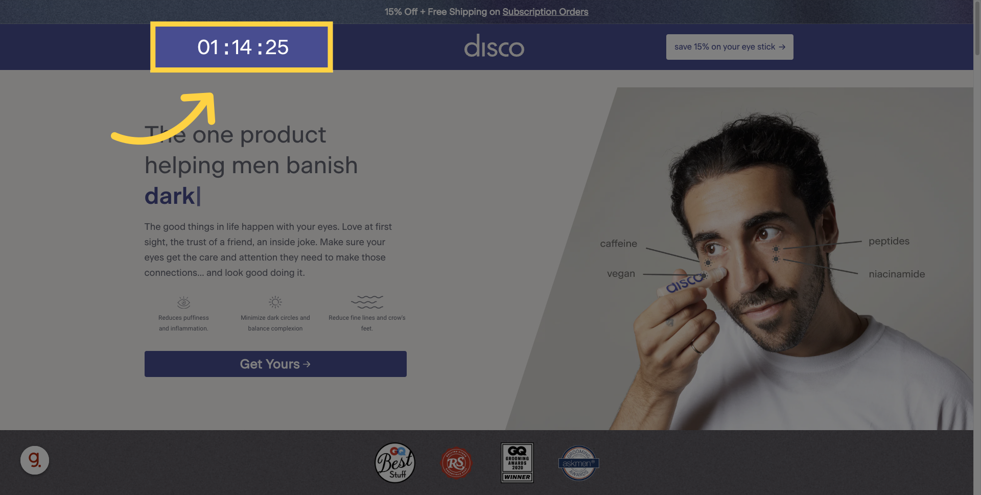
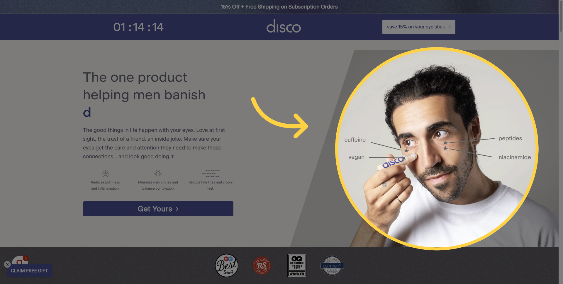
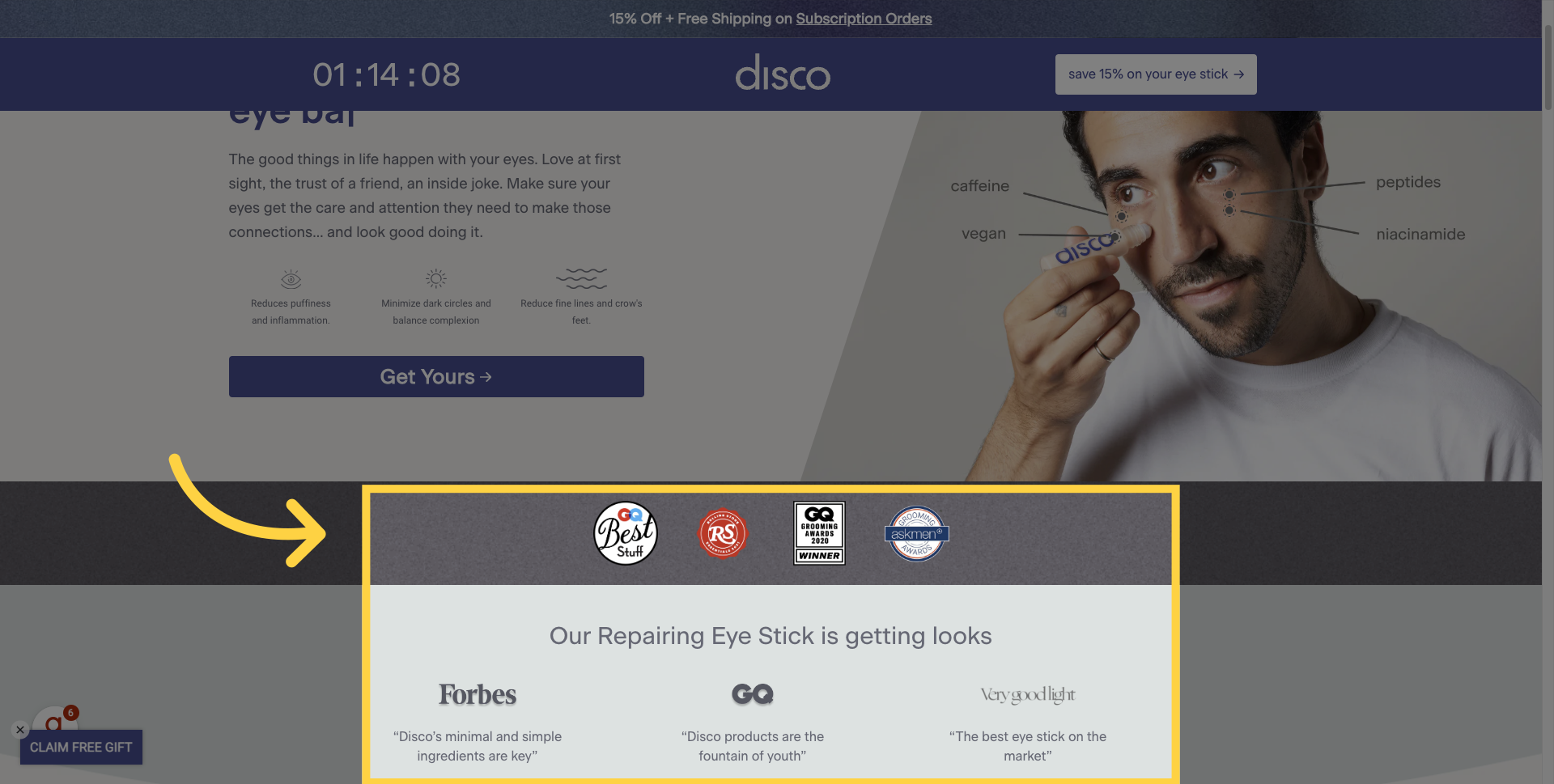
2. Real Life People
Next, Disco has done a great job of using real-life images throughout the site. Here, you can see a man who looks like he's just woken up; he's not necessarily a stunning model or a 'Fabio' figure. This is a really smart way of showing someone using the product, calling out some of the key features and benefits, and making it very relatable for the consumer. These types of images are littered throughout the landing page. Which is a really smart decision by Disco to show the user in these images in a very real-life scenario.
3. Trust Symbols
And right before the fold, what do we have? Trust symbols. And these aren't just a few high-profile logos, but actual quotes pulled directly from some of these reviews.
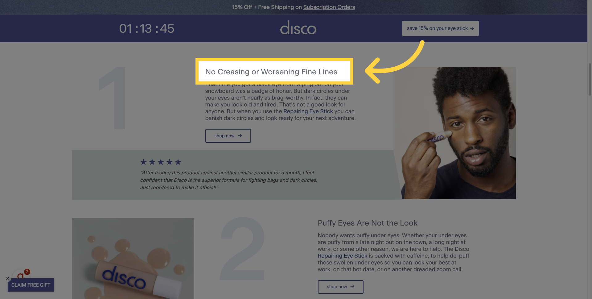
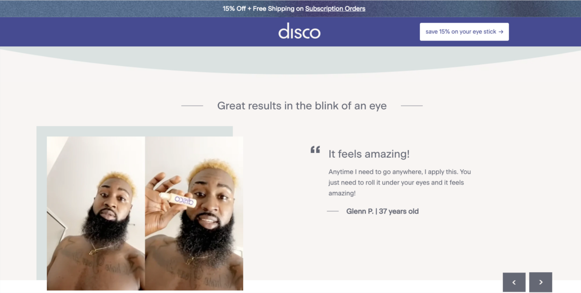
4. Testimonials
As you scroll down, you'll also notice a sprinkling of testimonials throughout the page. This adds a great deal of credibility and helps reassure visitors about the quality of the product.

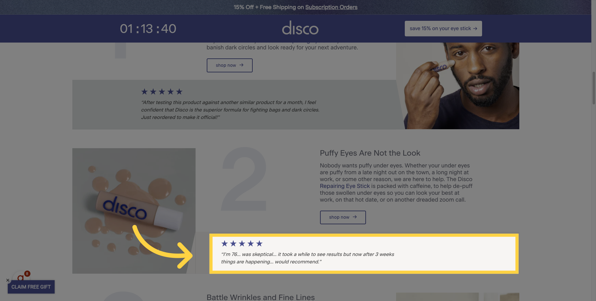
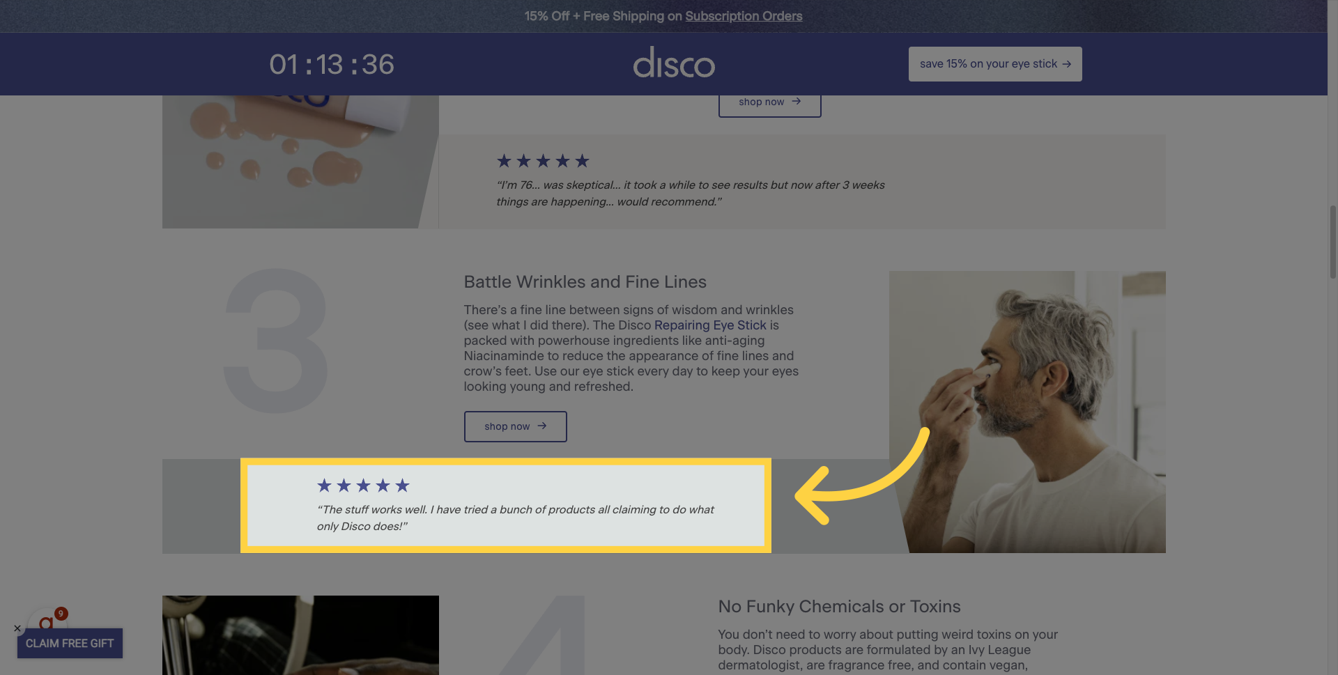
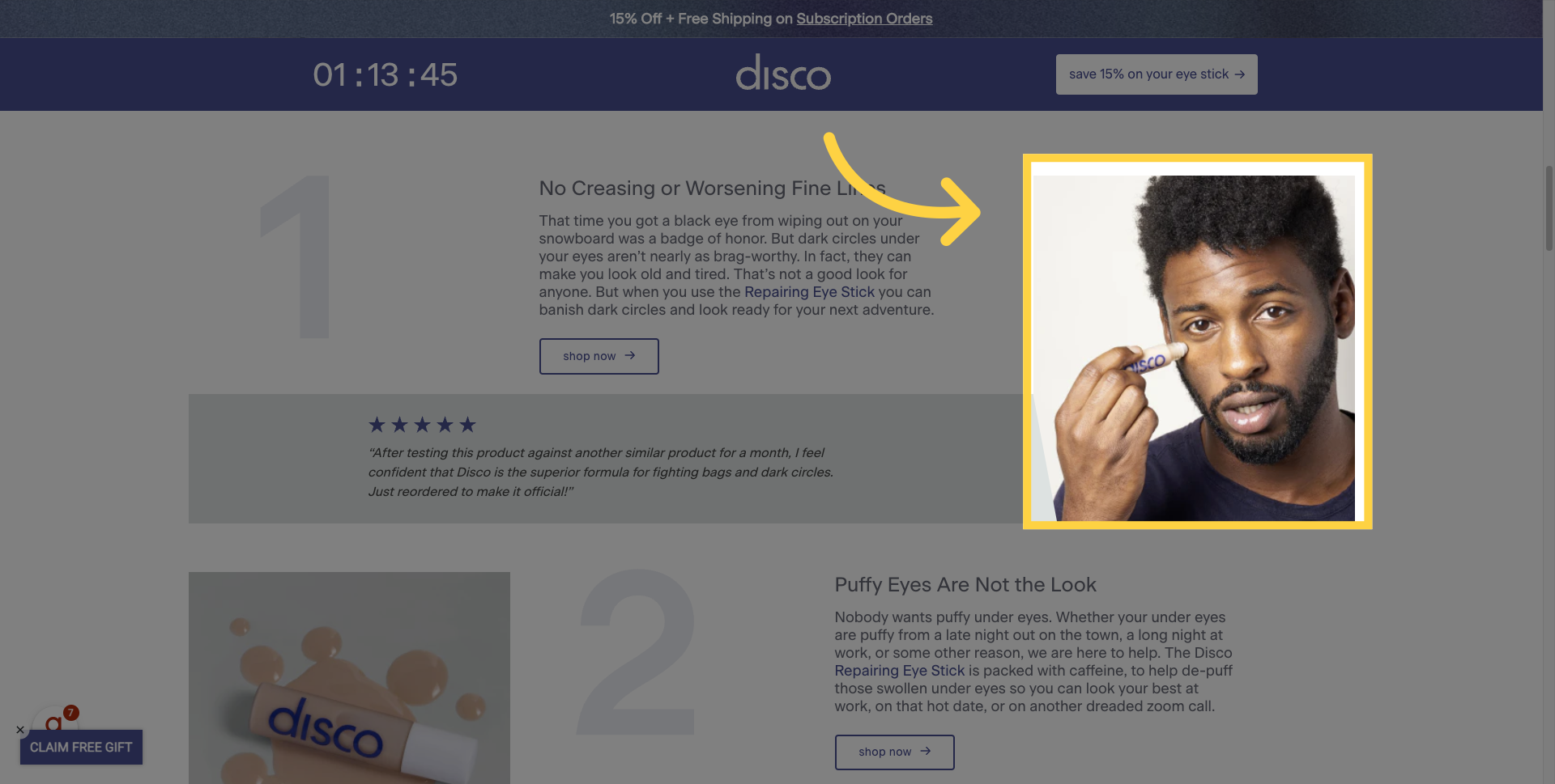
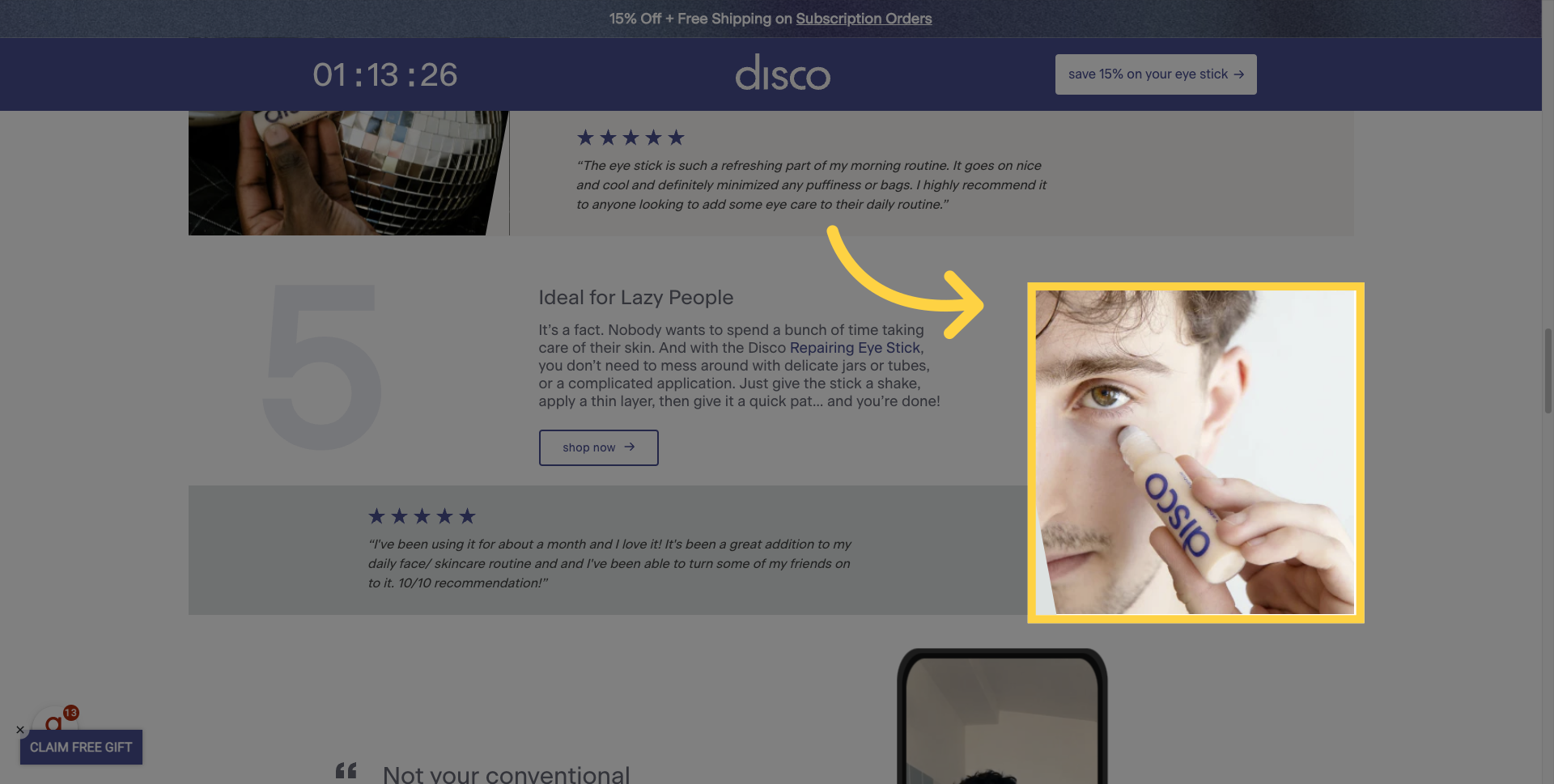
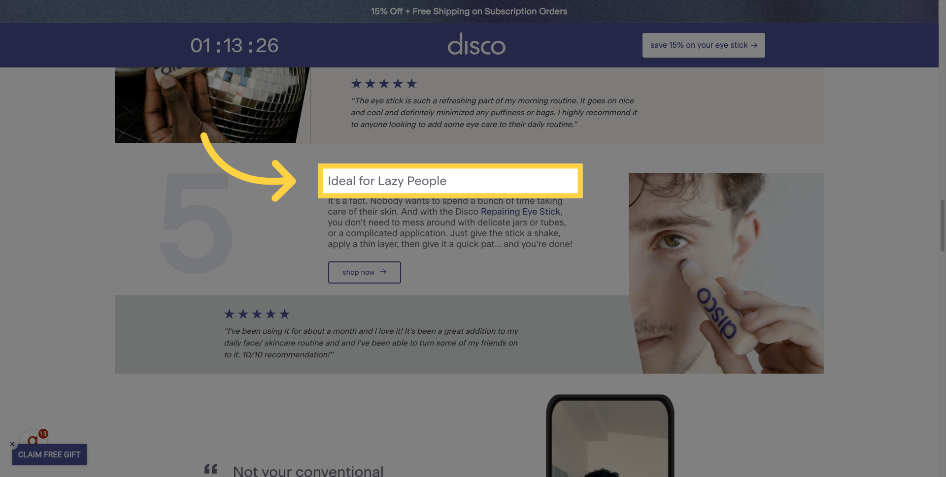
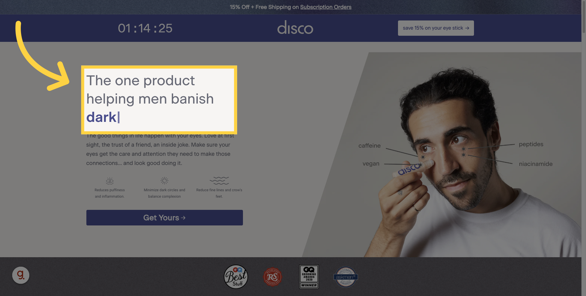
5. Tight Headlines
Coupled with those testimonials are really tight, clear headlines that highlight the problems most consumers are likely already experiencing or trying to avoid. For example, 'No more creasing or worsening fine lines'.
How puffy eyes are not the look.
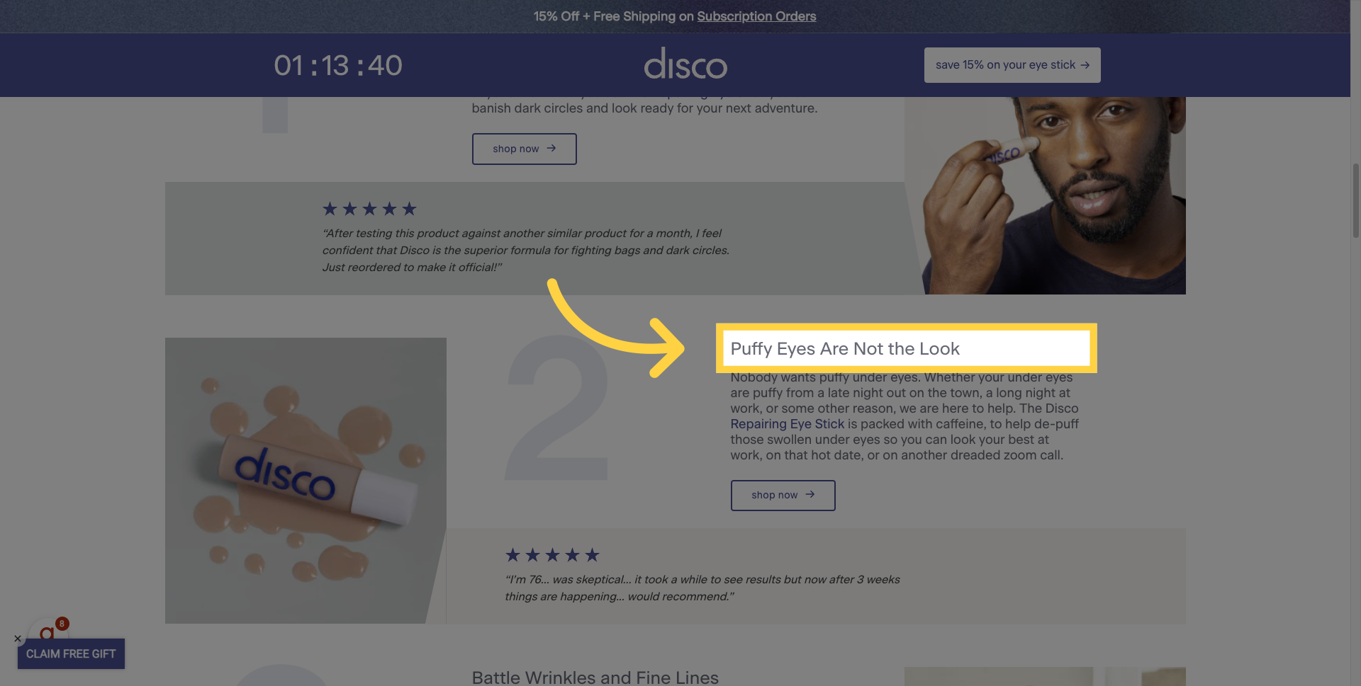
Or, my personal favorite, how this product is ideal for lazy people.
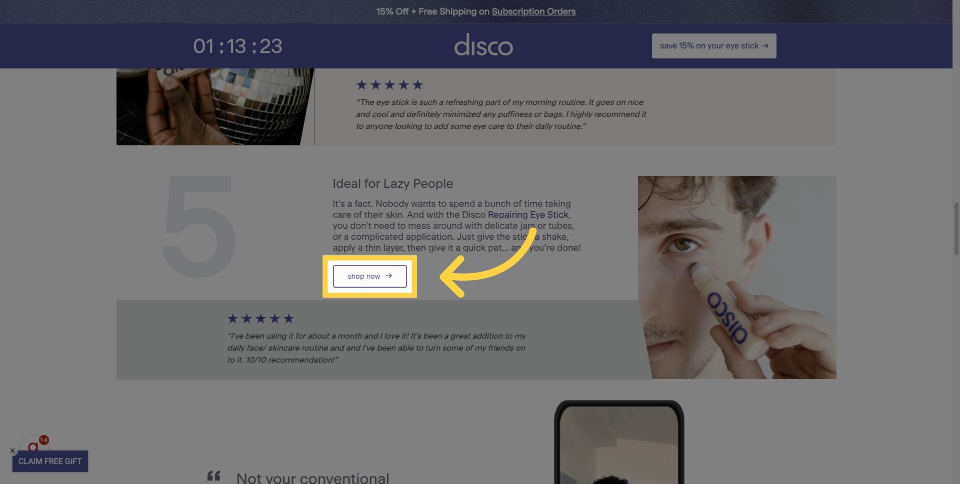
6. One CTA
And the button coupled with all of these elements is basic Landing Page 101: the 'Shop Now' button directs you further down the page with anchor text. You're not going anywhere else; you're staying on this page with one very clear call-to-action.
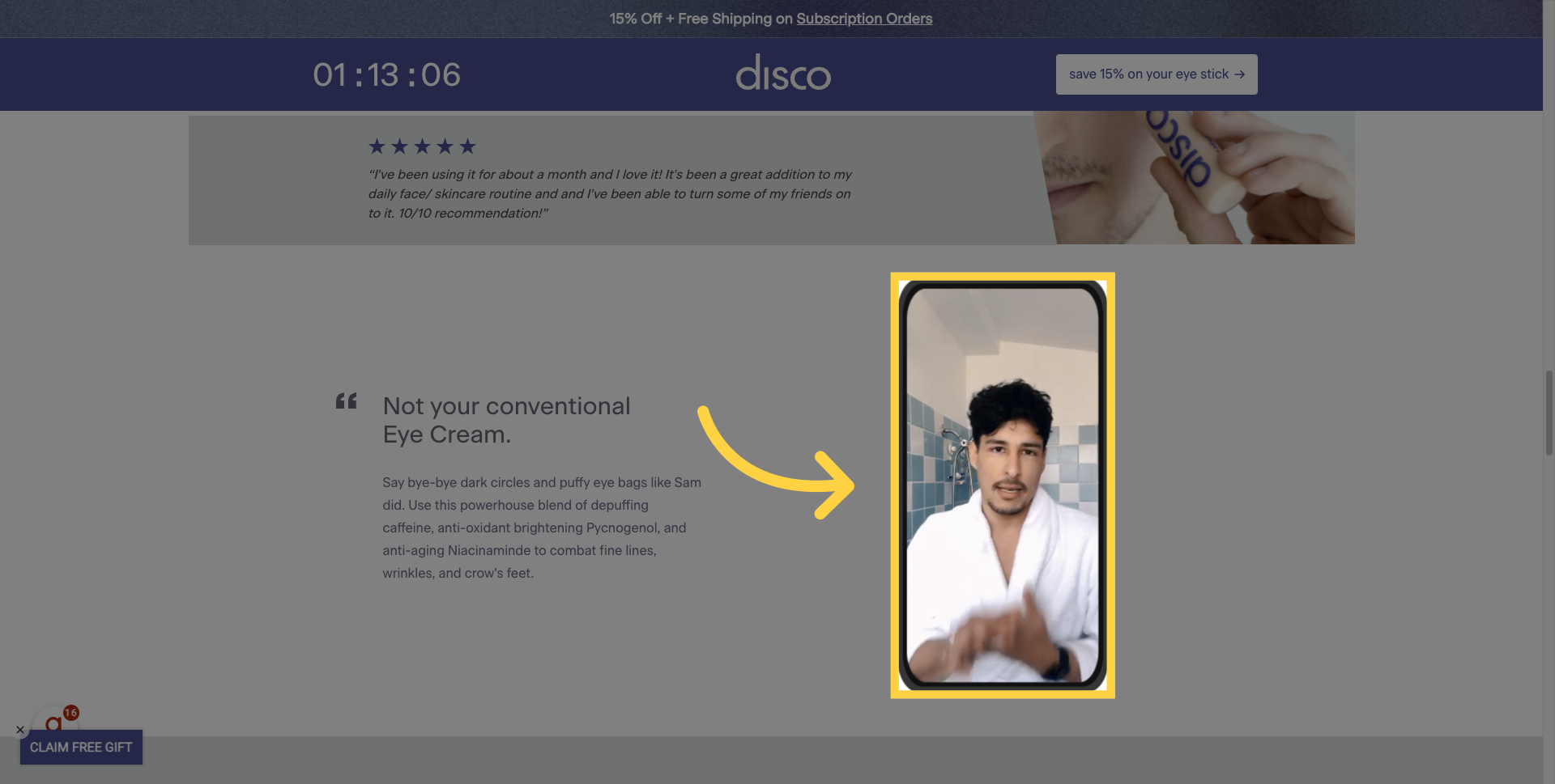
7. UGC
And as if testimonials aren't enough, what do we have here? A little user-generated content (UGC) action on why this isn't your conventional eye cream. This video does a great job trying to relate to the consumer, showing them how someone is directly benefiting from the product, and providing that extra sell from a real-life person. UGC has been a major driver for a lot of direct-to-consumer (D2C) brands, and we can certainly see why it's effective here.
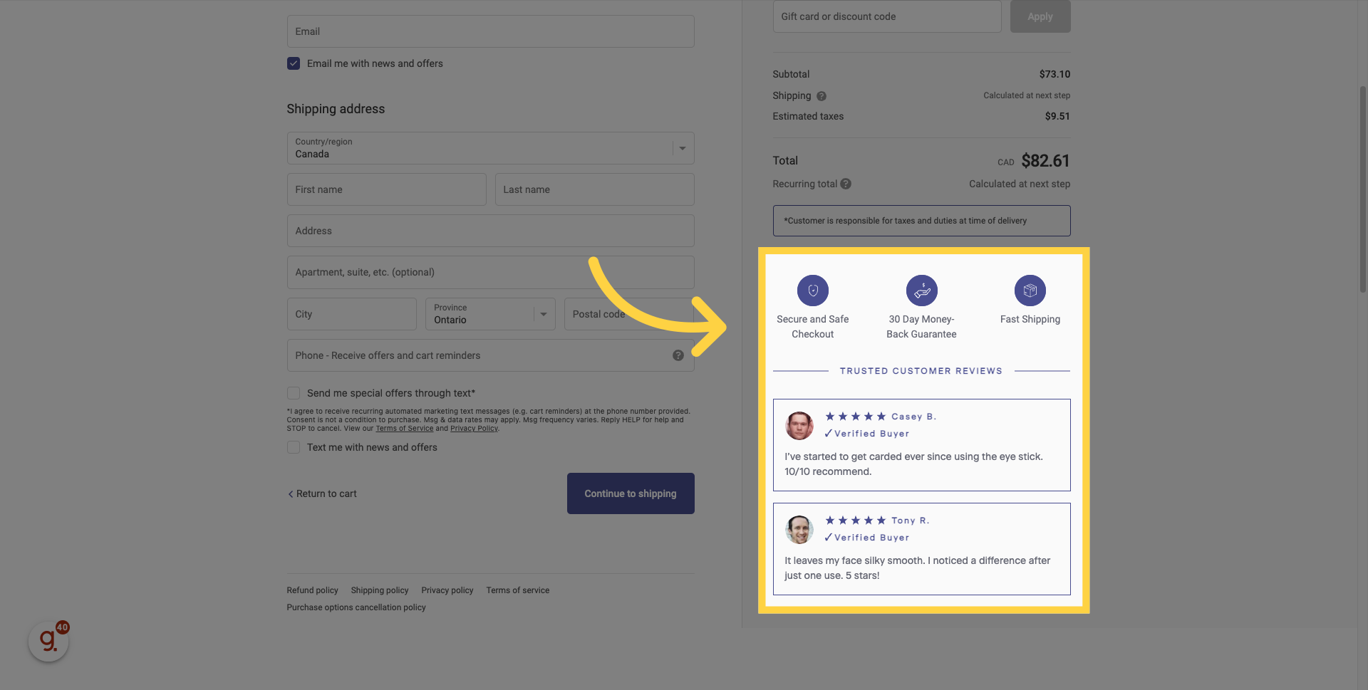
8. More Trust Symbols!
And just as you finally get to the product on the page, what do we have? More trust symbols. One indicator shows that this product is a bestseller, which helps reassure the consumer that they're in the right place. Secondly, there's a review from Spy.com, a site with one and a half million monthly views. It's really smart to reiterate that this is a product you can trust and that is loved by others.
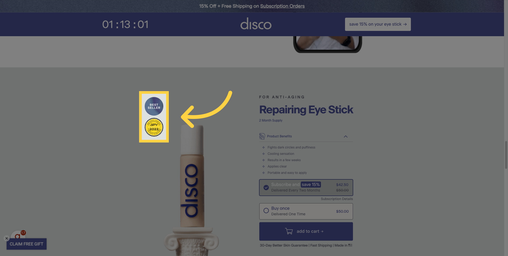
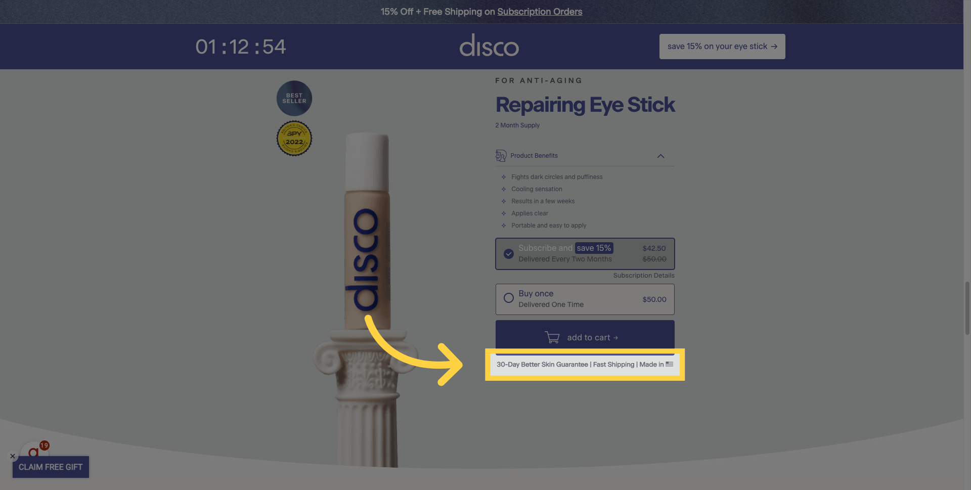
9. Lowered Barriers: 30-Day Better Skin Guarantee | Fast Shipping | Made in USA
If you look at the fine print here, they've done a really good job of indicating that you can trust this product and try it for yourself with a '30-day Better Skin Guarantee'. This alleviates some fears by offering fast shipping and a 'Made in USA' stamp. The latter's impact on convincing someone to make a purchase may be debatable, but they've already addressed two of the biggest fears people have: 'Can I return this product?' and 'How quickly am I going to receive this product?'
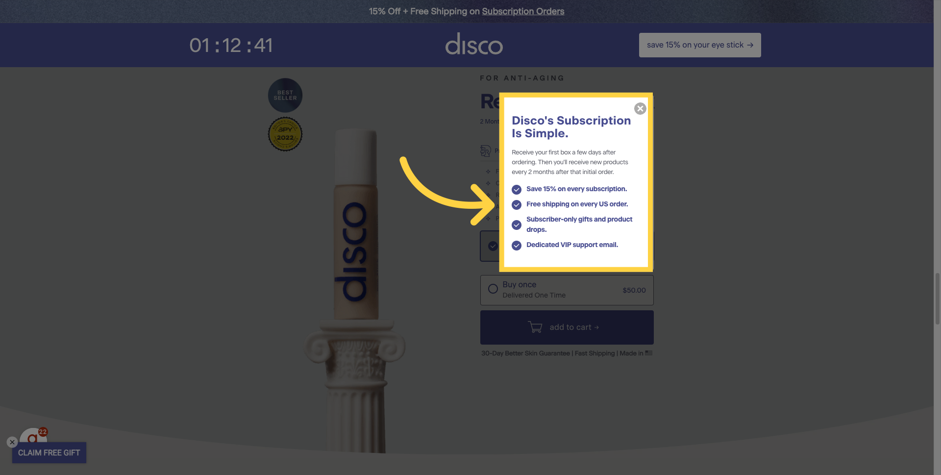
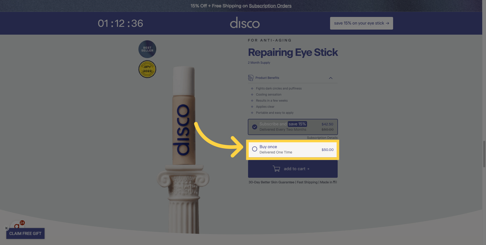
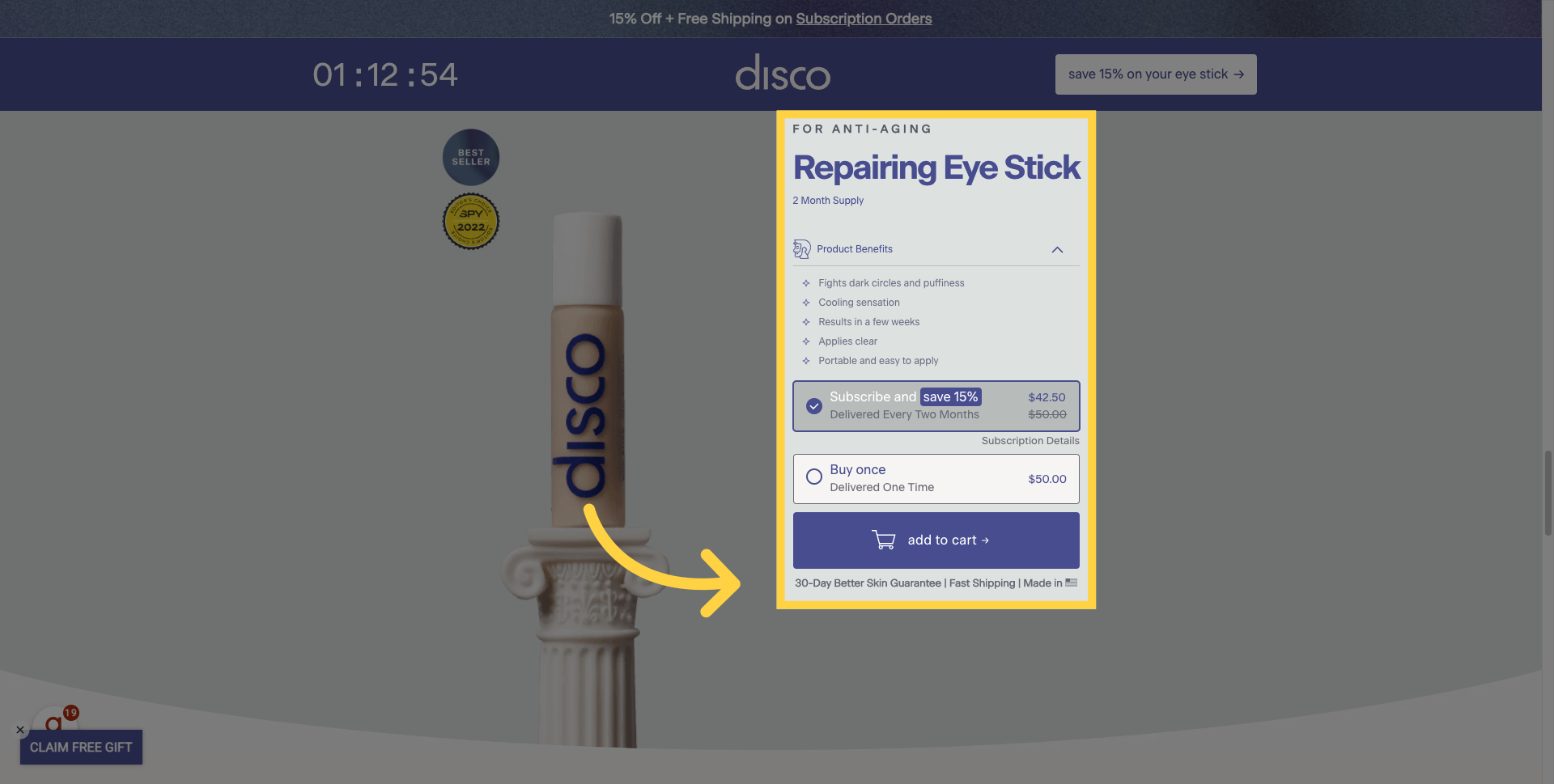
MISS: Subscription Details
One thing that I actually think is a significant miss here, though, is that a number of these details about the subscription have been hidden in this small text box.
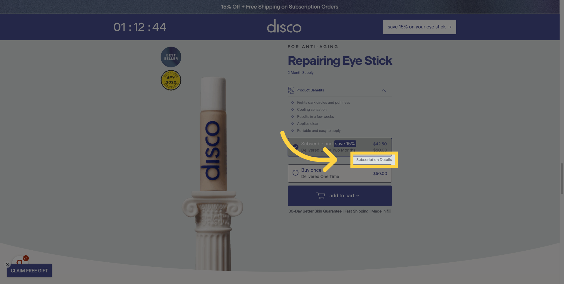
Free shipping is too hidden
For example, once you click and open that, you realize that you're saving 15% by subscribing. Now, this discount is visible in the header - '15% off and free shipping', which is again indicated here as 'free shipping'. But to me, that's something that they should really be highlighting in this product section to convince me to opt for a subscription purchase over a one-time buy.
So, me as a consumer, I don't think I'm ready to subscribe yet, so I'm going to try to take a look at the buying once offer.
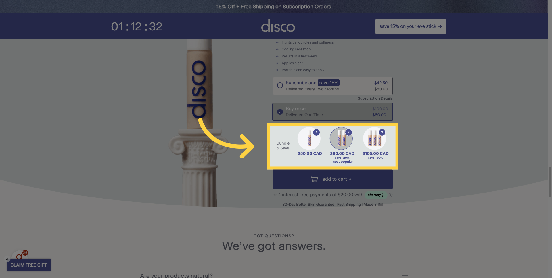
10. New Bundle Offer
This is actually something that I really loved on the page: after choosing to buy once, you're presented with a bundle offer. It's an excellent strategy to increase the average order value and potentially steer customers back towards that subscription model, which is a great benefit for direct-to-consumer (DTC) brands.
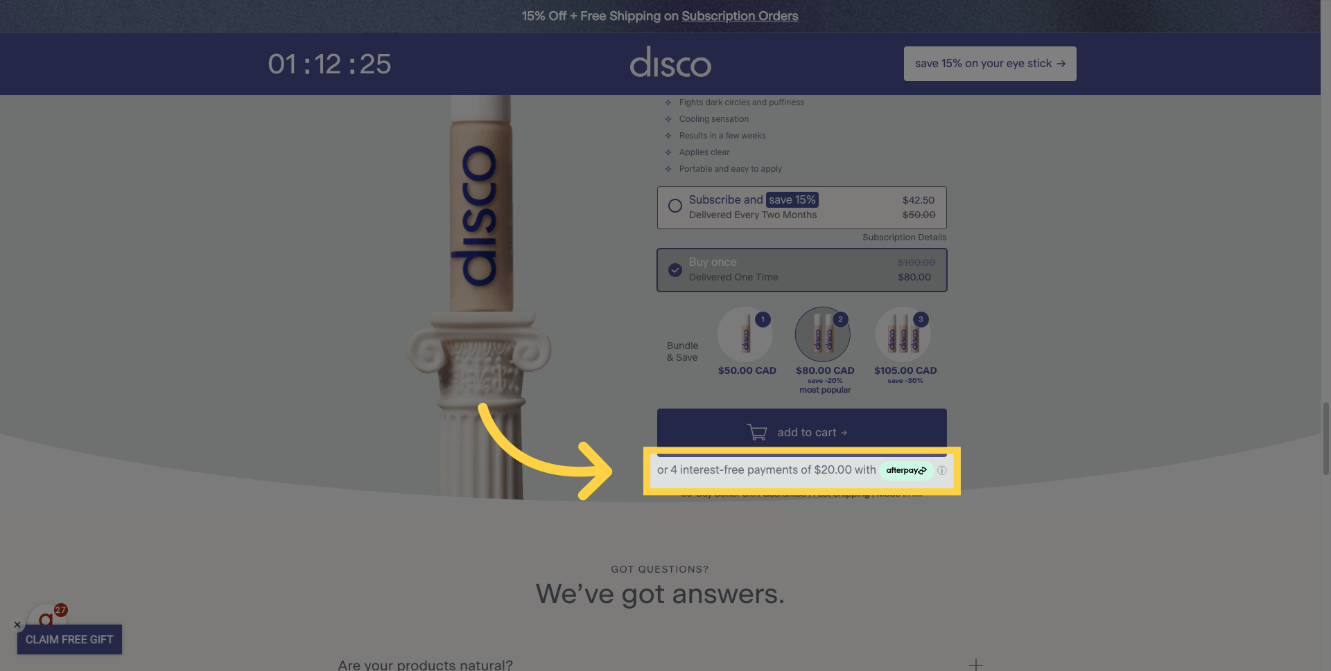
11. BNPL Option
Also, once you click on that 'Buy Once' option, you're presented with a 'Buy Now, Pay Later' feature with Afterpay. So if the price point is a bit too high for you, here's another way of trying to quell your fears and encourage you to make that purchase.
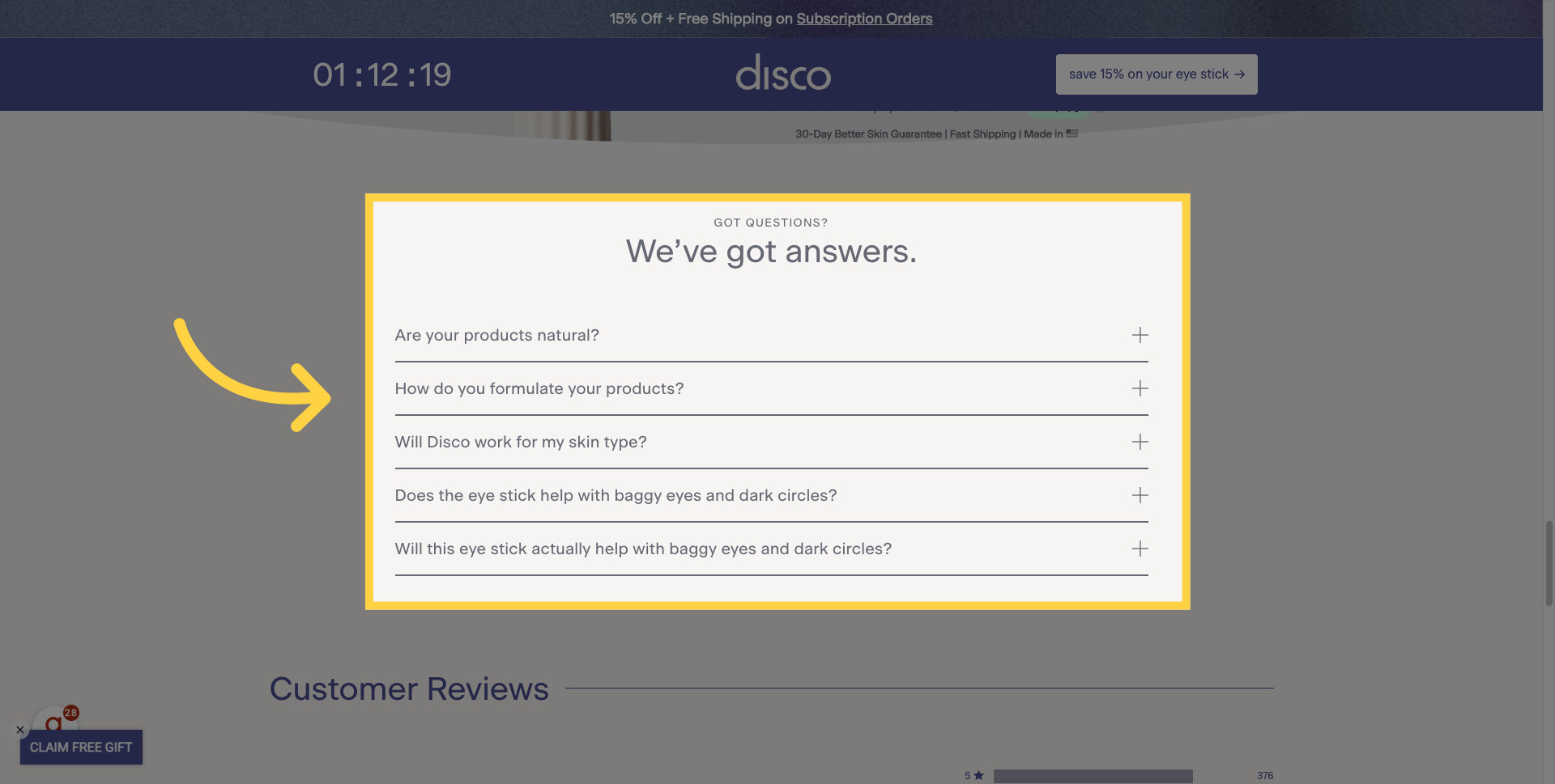
12. To the point FAQs
Perhaps I'm not ready to buy yet, so I'm going to keep scrolling. What I really like about this FAQ section is that it keeps things very short and concise. There are five key questions, all clearly asked. The FAQ section makes sense and offers very brief responses. They're not trying to overwhelm me with too much information or sell too hard; they're simply answering some of my key questions.
13. Great Reviews
And what do we have here? Customer reviews, and really good ones at that. Here we have a 4.7 out of 5 rating, a very strong trust symbol. But once again, these aren't necessarily from influencers; these are from paying customers. So, as helpful as user-generated content (UGC), influencers, and publisher reviews are, having real customers providing such positive feedback is an added benefit for any consumer or potential consumer.
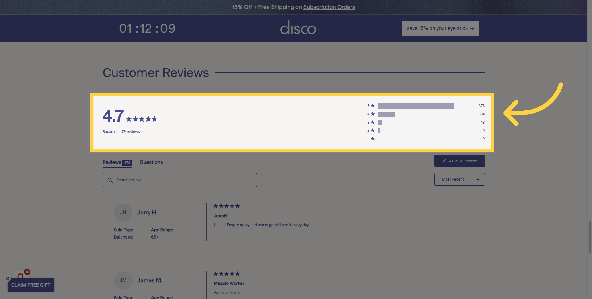
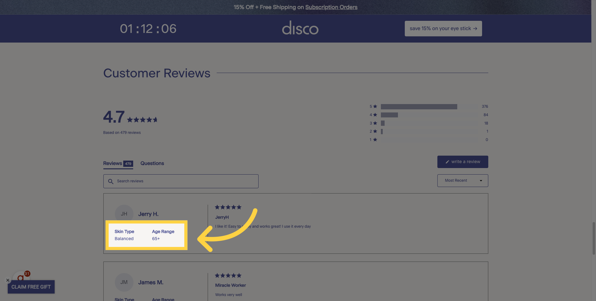
14. Age and Skin Type Included
And what makes these reviews extra relatable is the inclusion of details on someone's skin type and their age. Higher up on the page, it seemed like the product was primarily focused on a demographic of men in their thirties, but when you get into the reviews and see ages like '65+', '50-60', '20-30', it allows any consumer to relate. This mindset, 'This product is a good solution for me; they have the exact same problems I have; they're in the same age bracket', really sells the product effectively.
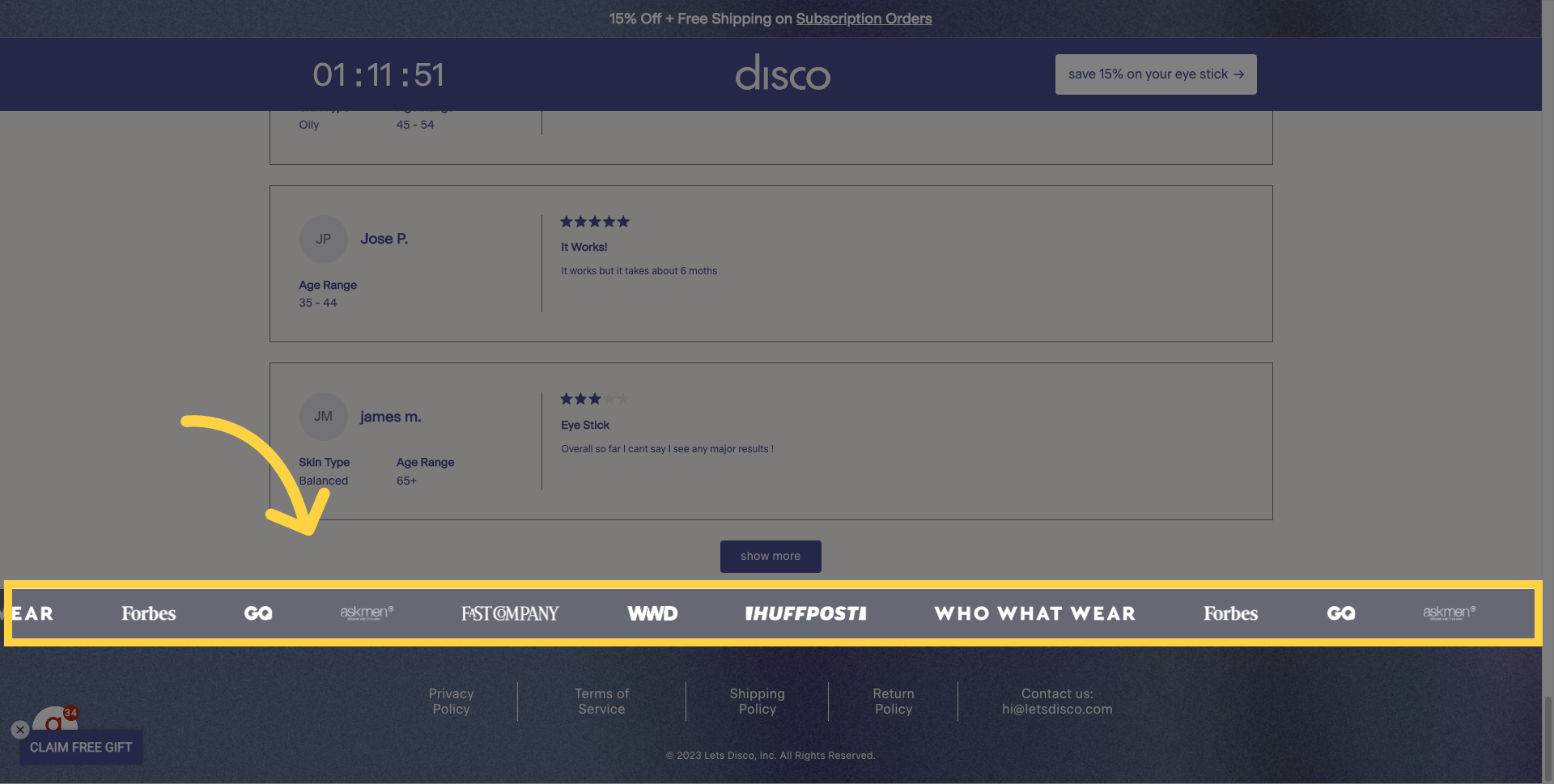
15. More Trust Symbols
If all that wasn't enough, what do we have again? Trust symbols. You've been shown trust symbols high up on the page, in the middle of the page with testimonials, reviews, plugs, and now, one last chance to show you that this is a quality product that has been featured in some of the most reputable publications in the United States.
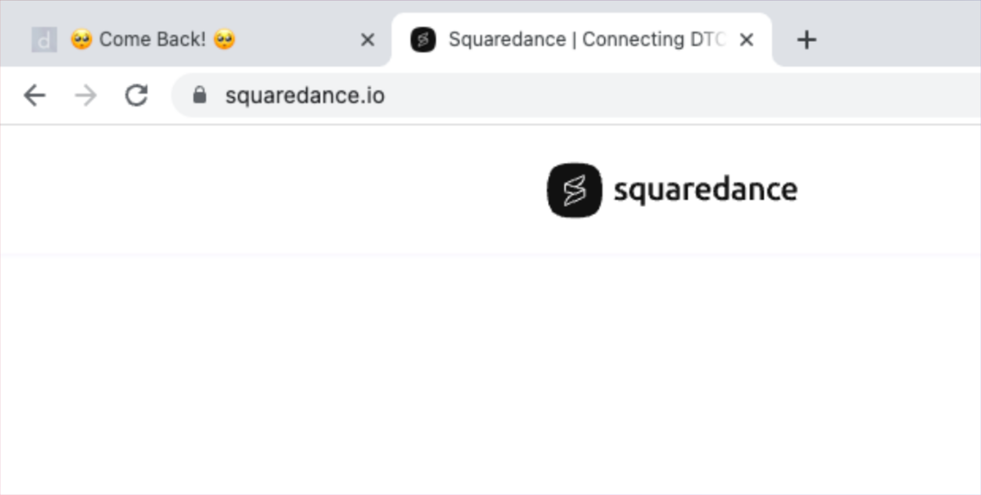
16. Come Back!
Now, I don't know about you, but I'm a very distracted shopper sometimes. So I decide to move over to another tab, but what do I see? An animated feature of two side eyes and then I come back. This text is constantly scrolling just to try to grab your attention one last time and get you to come back and complete your purchase. Again, this is a really smart move.
17. In-cart Add Ons
So, having gone through the entire page, I've encountered a lot of great symbols, really helpful testimonials, and they clearly understand the problem they're trying to solve in a way that is relatable to me. This is especially true after seeing some of those customer reviews. So, I've added the product to the cart, and a couple of things I appreciate are: one, the Shopify checkout, which is very familiar and lets me know this is a site I can trust; and two, just the add-on features trying to get me to increase my average order value.

18. Even More Trust Symbols!
And just in case I'm a little hesitant about actually continuing to the shipping page and finishing that checkout, what do we see here? More trusted customer reviews and more methods of trying to quell any fears I might have by stating there's a '30-day money-back guarantee', my checkout is 'safe and secure', and the shipping will be 'fast'.
Areas to Improve: Add the word "use"
Now, there are a couple of things I might consider tweaking. First, people are often more receptive to taking action from a header. So instead of saying "The one product helping men banished X," simply adding the word "Use" before it could be a very simple but effective solution here.
Areas to Improve: Slower Slider
There was also the slider testimonial section, and while I appreciate the inclusion of the user's age, it was scrolling a little too fast. Slowing it down a bit could be a very small but helpful change to improve its effectiveness.
Lastly, making it clear that the subscription offer includes free shipping should be listed under the featured benefits or appear the moment someone clicks on the "Subscribe and Save" option. This subtle difference might convince a few more people who are hesitant to click the "Subscription Details" button to know that there's an added benefit when they subscribe, aside from the 15% discount.
So, there you have it! A breakdown of what I love about Disco's landing page. It's a great example of how to effectively use real-life images, trust symbols, testimonials, reviews, and targeted messaging to appeal to a broad demographic. The strategic placement of product offers and bundling, add-ons in the cart, are designed to maximize the average order value. The "Buy Now, Pay Later" feature and skin guarantees further boost customer confidence. I'm excited to see how this page evolves and continues to optimize for an even better customer experience.


